TLDR;
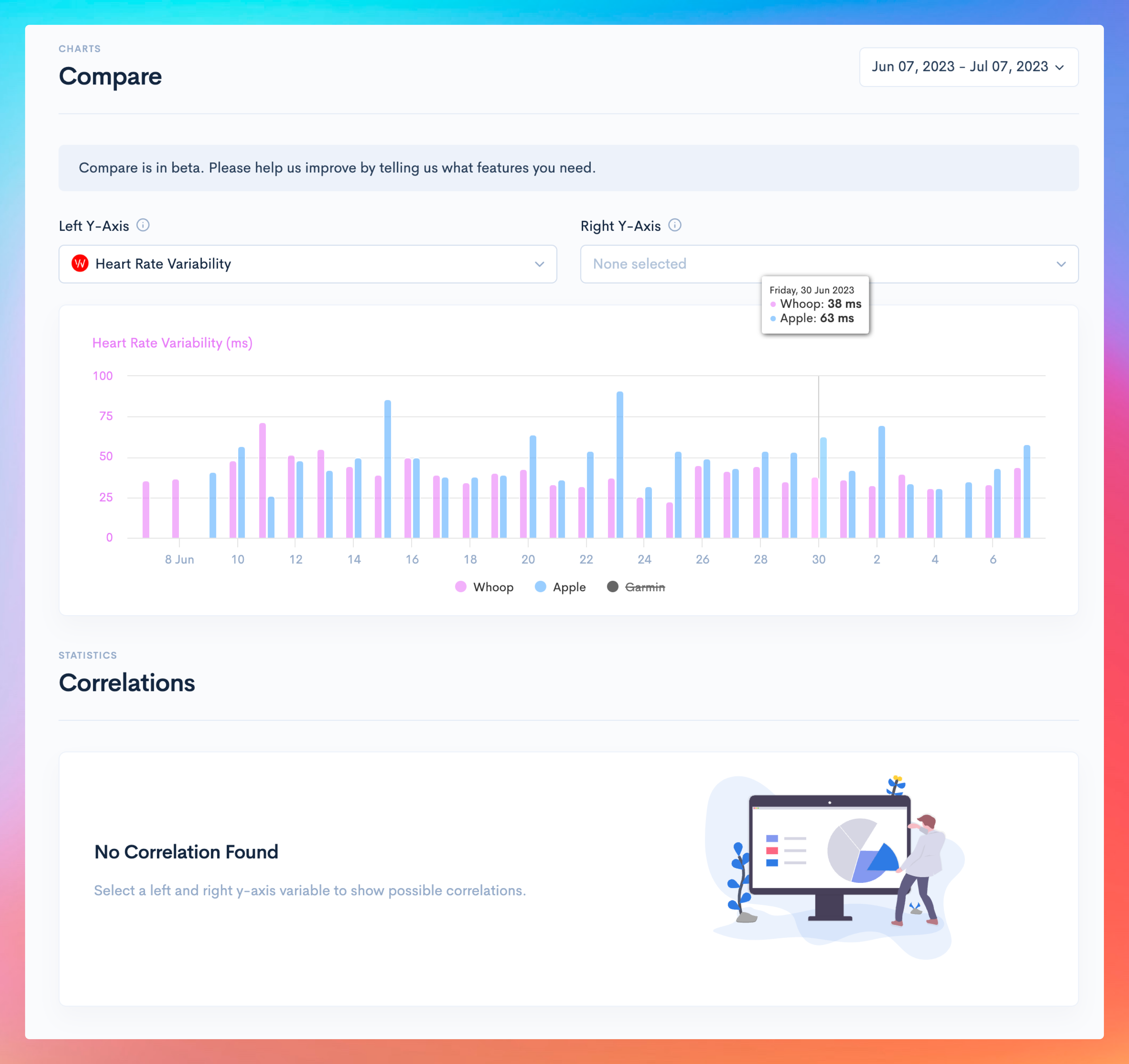
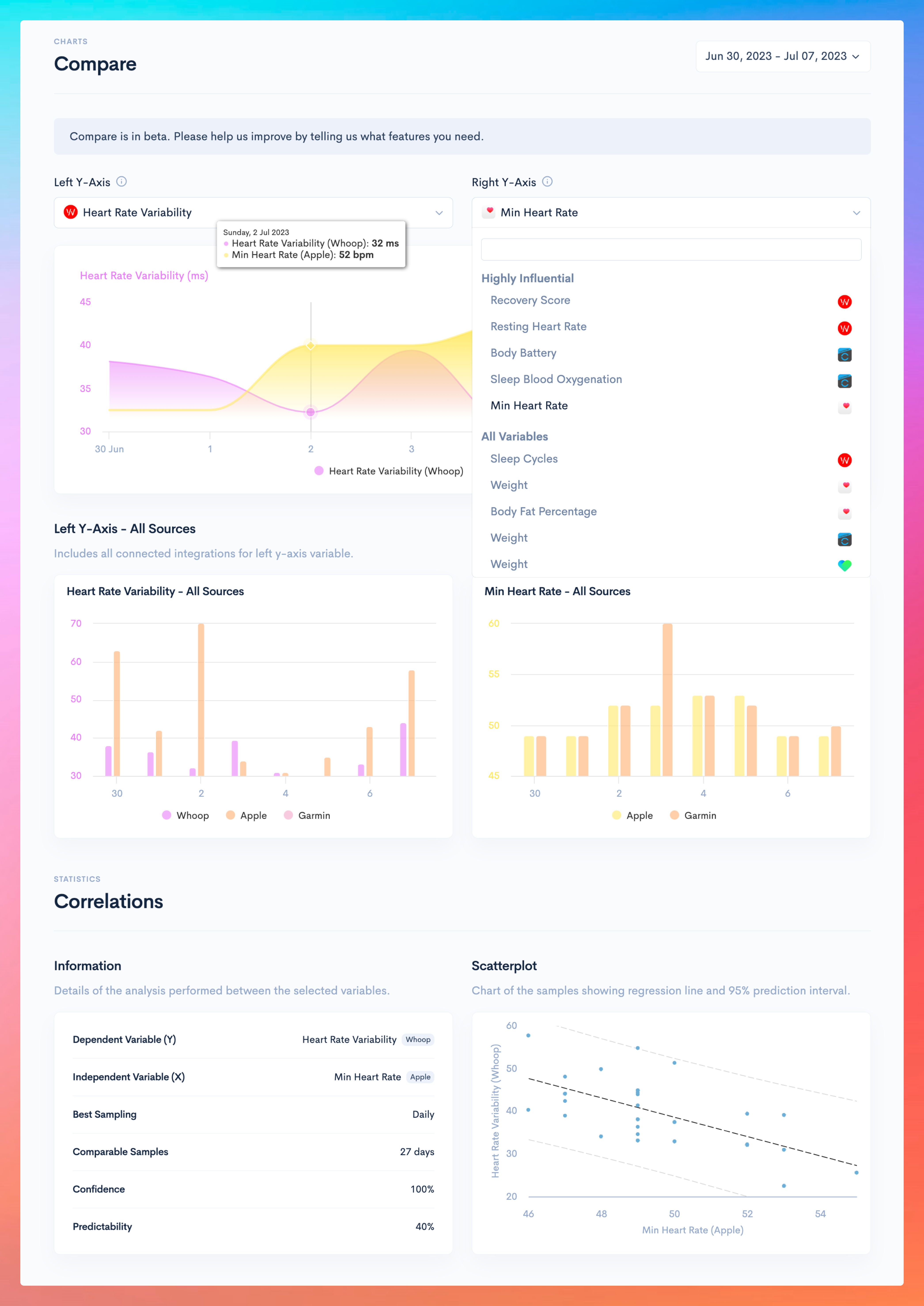
We added a new Compare page, plus correlations.Compare
- If you pick a variable for left y-axis, it will populate the chart with all sources.
- The right y-axis dropdown allows for adding a comparison variable to the chart. We sorted these by predictability from your statistics data and added the scatterplot (Premium users)to the bottom of the page if there is a correlation.
Try it now:
Examples:
1 Month Free
- Use code CG9U3C2Afor 1 month free.